

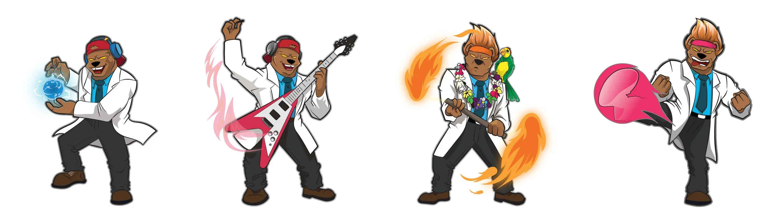
NATURE GAINS | PROTEIN GUMMIES PACKAGING
Working with the team at Nature Gains, I was asked to redesign their protein gummy packaging. The aim was to create a brand identity that could stand out from competitors like Nexus Per4m, which utilises a brand mascot. Working with a freelancer, I art-directed a set of illustrations that closely resembled the original drawing. Through collaboration, we developed a unique expression for each flavour. While keeping a consistent character style for each product.


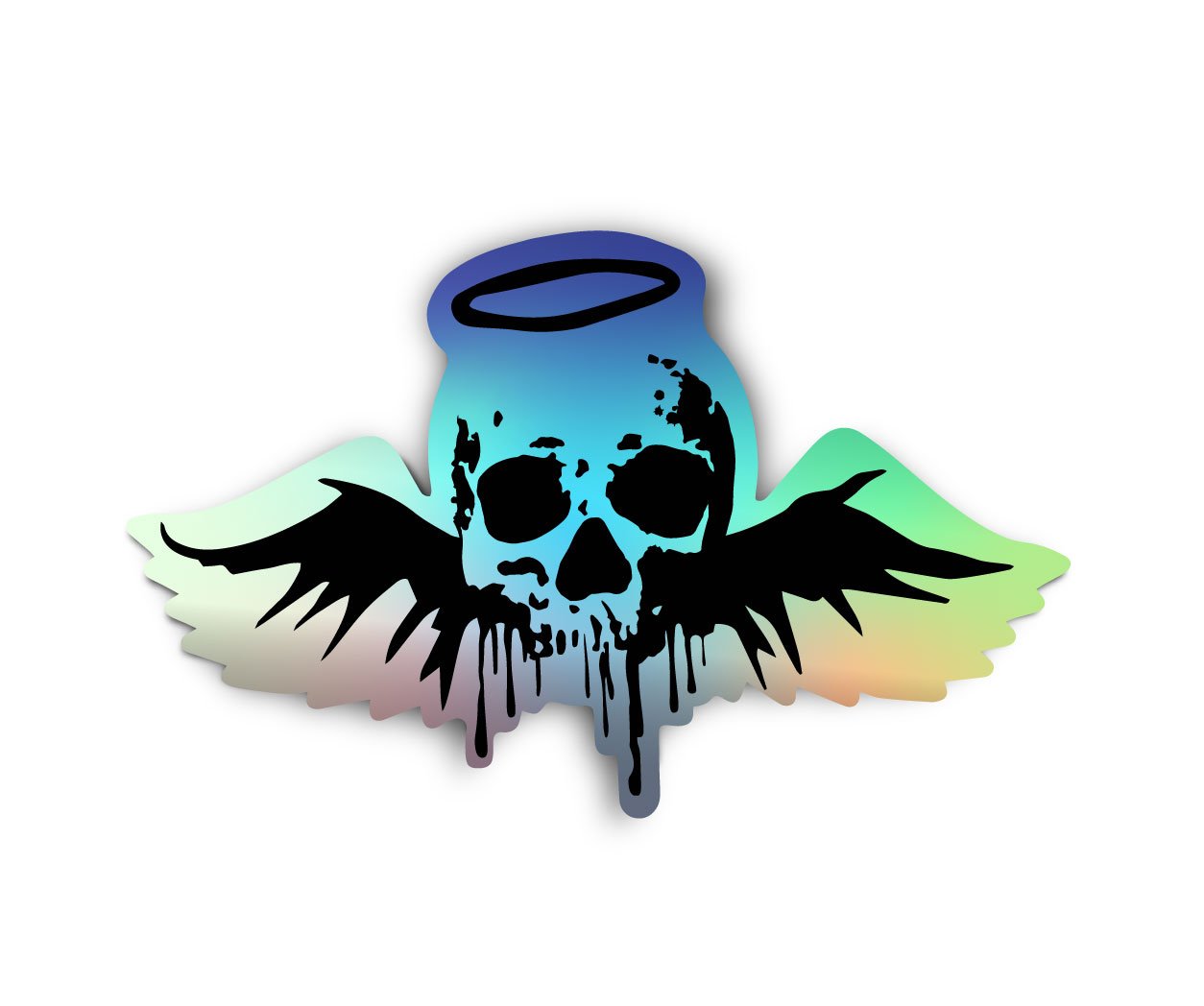
FRACTURED ECHO | SCIFI HORROR COMIC BOOK
Fractured Echo is an upcoming sci-fi horror comic book that I authored, featuring collaborative art direction with a talented artist from Brazil. Successfully funded through an Indiegogo campaign, the project garnered $3,000 and is currently in the production phase.
T-shirt Design Variations
Bookmark
Keychain
Holographic Sticker
A1 Poster
NFT
MY LITTLE SECRET | ROMANCE BRAND
My Little Secret is an e-commerce store I co-founded, which sold sexual health products. After analysis of competitors in this industry it became clear the brand and store needed to have a clean and safe appearance for it to gain customer trust. I translated this into a brand identity build around the idea of romance, which I felt solved the issues that our target demo had with competing e-commerce stores. My Little Secret borrowed elements from luxury health and wellness brands like Dusk.com.au and Lush.com to give customers a similar sensual and relaxing shopping experience. From customer feedback we discovered that this approach helped eliminate any guilt or shame that usually came from a purchase of this kind of product.
COCOFUSE | HEALTH AND FITNESS BRAND
Cocofuse was an e-commerce store that sold diffusers. I was asked to develop a brand identity that would allow the store to sell these products at a premium price. Taking into account their competitors and the founders values of heath and fitness, I created something that felt more like a health and wellness brand. I used a set of pastel colours and nature tones, along with imagery of fit and health woman to comuniacte a higher set of values and standards. Giving customers the impression that the brand represented a premium status of health and wellness products, visually this helped justify the premium price tag.
Instagram Posts
Email Signature
White Label Mock-ups
LET ME LEARN | EDUCATION BRAND
Let Me Learn was a start-up focused on creating pathways for people into new career opportunities. It did this by facilitating the training and education of students, primarily those who didn’t do well in traditional school. I was tasked with developing a variety of branded assets that would communicate a kind and understand visual tone. I achieved this by using colours and shapes found in their existing logo. In an effort to put students at ease and to give the brand a college feel I developed a mascot, represented by an owl with a graduation hat. This allowed me to create collateral that helped students feel a sense of guidance, and helped them understand the information presented to them in class.